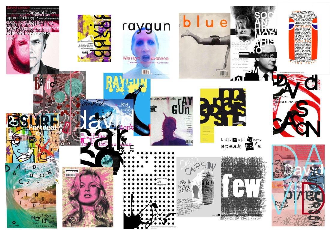
I chose to put these images together as they are all David Carson designs. They all have very unique typography on them which makes them stand out. Not all of them have bright colours on them but even with them being monochrome, the designs are still eye catching to me. I put these onto the A4 photoshop document by copying and pasting images from my pinterest.
David Carson is a prominent contemporary graphic designer and art director. His unconventional and experimental graphic style revolutionized the graphic designing scene in America during 1990s. He was the art director of the magazine Ray Gun, in which he introduced the innovative typographies and distinct layouts. He is claimed to be the godfather of ‘grunge typography’ which he employed perpetually in his magazine issues.
His work is characterized by the chaotic typography and pattern it embodies, disarray of photos overlapping each other, seemingly meaningless at the surface but holding a larger picture. To put in simpler words as Albert Watson stated, the disorganized use of his typography has its own purpose, such as the each stroke of a painter’s brush evoke different emotion, imagery and idea, so does Carson’s designs possess such attributes. Where his innovative style of visual communication attracted new readers it also repelled many who considered his work fractured, hence misleading.
